So I’ve been away very often and when I was home I’ve been pretty busy with work for the last few weeks. In the last few days I finally had some rest, especially after the last week in Czech Republic, where I did part of my data exploration for a recent Data Science project on Fraud Detection in SMS (project is still work in progress). But let’s get back to the topic and talk about R and Leaflet and mapping Open Data.
Strolling for data
I’ve been looking for a nice project to do on my holidays and figured that I should probably further improve my R skills. So I searched for Open Data Sets and found a lot at Open.NRW that was recently started and is a great site to find open data for my county in particular.
I decided to do some visualization on environmental data and picked some files on particulate matter (PM) from lanuv.nrw.de. PM10 includes fly ash and cement dust and oil smoke from industrial sources but also pollen, setting dust (i.e. Sahara sand dust) and some spores and dependent on their type can be very harmful to our climate and health. PM10’s cause much higher risk of lung cancer, asthma and other respiratory diseases and also absorb (extra-)terrestrial radiation and thus have a direct influence on our climate. Particulates also cause these beautiful gray/pink sunsets.
In the EU the threshold for the average PM10 per year is 40 µg/m3, while the daily threshold is 50 µg/m3 and shall not be triggered more than 35 times.
In Northrhine-Westfalia the LANUV is measuring all kinds of environmental data with multiple stations all over the county. Besides decades of historical data, they also offer daily averages calculated every full hour.
Data Preparation in R
First of all, I created a data.frame containing information about the available stations. I could have done this via web crawling but decided to do it by hand for now.
Next I downloaded the current *.csv containing the PM10 averaged over the past 24h for the current running year. I ran into some problems with the column titles being written with special characters, which read.csv() could not read. So I had to write the names by hand:
fs.raw <- read.csv(url("http://www.lanuv.nrw.de/fileadmin/lanuv/luft/temes/PM10F_GM24H.csv"),
    header = FALSE,
    sep = ";",
    comment.char = "#",
    skip = 2,
    col.names = columns
 )
fs.num <- fs.raw
fs.num$Zeit <- as.POSIXct(paste(fs.num$Datum,
        fs.num$Zeit),
        format = "%d.%m.%Y %H:%M", tz = "CET")
fs.num$Datum <- as.Date(fs.raw$Datum,
        format = "%d.%m.%Y",
        tz = "CET")
Data Wrangling
After everything was set up I started extracting relevant data to show on a map. I calculated the yearly average, counted all days breaking the threshold and added categories to these two values. Easy enough!
Visualize with Leaflet
To bring all the data to a nice explorable map I peeked into multiple mapping libraries in R and set for Leaflet. This package is doing much similar to ggmap and others but I liked the simple options to add multiple layers to a map. The pipeline in R makes setting everything up very slick:
m <- leaflet(fs.stations) %>%
addTiles('http://korona.geog.uni-heidelberg.de/tiles/roadsg/x={x}&y={y}&z={z}',
attribution='Imagery from <a href="http://giscience.uni-hd.de/">GIScience Research Group @
University of Heidelberg</a> — Map data ©
<a href="http://www.openstreetmap.org/copyright">OpenStreetMap</a>') %>%
addTiles('http://korona.geog.uni-heidelberg.de/tiles/adminb/x={x}&y={y}&z={z}') %>%
setView(7.33, 51.28, zoom = 8) %>%
addCircles(~lon, ~lat,
popup = popupText(as.character(fs.stations$Name),
as.character(fs.stations$Address),
as.numeric(fs.stations$Height),
as.character(fs.stations$AreaType),
as.character(fs.stations$StationType),
fs.stations$PM10_yMean,
fs.stations$PM10_above_d,fs.stations$current),
weight = 8,
radius = ~ifelse(type == "A", 100,
100 * fs.stations$PM10_above_d),
color= ~ifelse(typeC == "A", "gray",
pal2(fs.stations$typeC)),
stroke = FALSE,
fillOpacity = 0.7)
m
The result
That’s about it. I will upload the result to my new AWS EC2 server once I have figured out how to set up shiny properly in connection with my website. For now I leave you with a peek into the result:
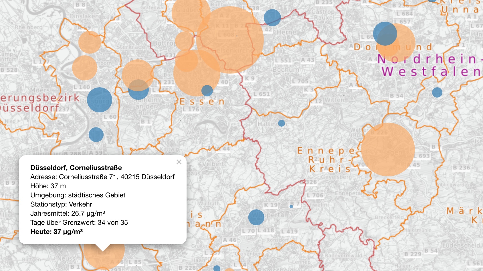
PM10 in NRW, Germany [2017-4-15]

A Data Science consultant working at Sopra Steria. He occasionally blogs about data and related topics here and is the host of the Dortmund Data Science Meetup.
Martin Schmitz
Hi Paavo,
i wasn’t aware that you can do that nice plots with Shiny 🙂 Looks like something to look at.
On a side note: Do you think you can get enough open data from sources like this to do “political targeting” for state or federal elections?
~Martin
Paavo Pohndorff
The viz was achieved with the leaflet package. I hope to implement this into shiny. I’m still figuring out how to 😀
Regarding political targeting: I was looking into different data sets from open.nrw and some of the data might help understand problems in specific areas and getting some insight what and how to target groups in there (like running a campaign with focus on reducing traffic noise in specific areas).
Martin Schmitz
Hey,
i was rather thinking to take the trend of last state/federal election as a label for a predictive campaign. One would then try to identify where a party has the most potential to exceed it’s potential.
Not sure on the exact process yet 🙂
~Martin